More Contrast needed
I'm so happy that I just got my internet connection back up that I decided to post straight away! We have been without internet (wi-fi that is) for 3 days now, and it is scary how used I have become in having internet available all the time, and how dependent you can say that I have become of it. I was able to read and look at everything if I wanted through 3g on my phone and pad, but I still prefer to use the internet on my computer. I did get more painting done though, so maybe I have to take a few days a week as 'no internet-days'…


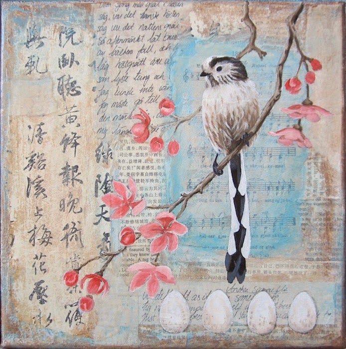
I added the first layer of colours to the long-tailed tit. I wasn't totally happy with how it looked though. It seems to lack something. I really liked the background as such, but with the pale bird everything looks, well, too pale… A dark bird would have been better maybe. So I decided to darken up the background giving it some more contrast so that the bird would 'pop' more.

Here is the same painting but with some added darker colors to the background. I noticed now that the photo is a little bit blurry. Maybe I re-sized it too small this time? Oh, well. I think it looks better now. I decided to go for paler pink flowers. I do love these birds, they are just so darn cute!!

White and pink. I like how simple this image is. Now I only have to finish it. One more layer of oil should do the trick.

Comments
Post a Comment